Will HR projects ever be financially measurable?

It’s impossible to measure the financial value of all HR focused projects.

While there may be exceptions like reducing annual leave liability or reducing insurance premiums, overall HR projects fail to have a real dollar benefit associated to them. Often this means that the HR projects are approved because decision makers intuitively feel that there will be benefits but they do not believe in actual business case.

Instead of using intuition to approve HR projects you can you Value Driver Modelling (VDM) to assess the real financial benefit of a project. Using a VDM-based tool, like the  Value-Driver Psychological Assessment Tool (VD-PAT), you can specifically assess which parts of the project are going to affect which areas of the organisation and so in turn make an assessment as to the financial improvement possible from the project. Not only does this allow you to assess the value of the project by its self, but you can also assess the value across a whole portfolio of interrelated projects

The diagram below provides an overview of how information flows into and through the VD-PAT:

Value-Driver Psychological Assessment Tool VD-PAT

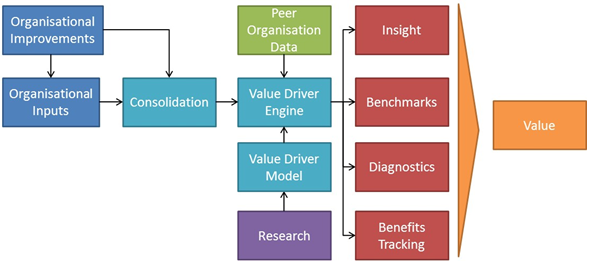
Organisational inputs provide the information required to understand how an organisation currently operates.

Inputs are collected from surveys, interviews, observations and enterprise data. The inputs may be for a single point in time or could be collected regularly over a period of time to track changes. Inputs may be collected for a specific team or unit within the organisation. Inputs may also be collected for certain aspect of an organisation, for example, job characteristics only.

Organisational Improvements are the improvements made to specific psychological factors within the organisation as part of a HR project.

An improvement may impact one or more psychological factors. It’s then possible to follow the impact that these changes have on organisation through empirically proven correlations and relationships.

There are two external inputs that provide information to the tool.

  1. Peer organisational data is used to compare organisational performance as well as provide information for further research.
  2. Research from peer-reviewed, empirical studies is used to find the inter-relationships between different organisational psychological factors. This informs the development of the Value Driver Model, which in turn drives the formation of the Value Driver Engine.

Within the tool there are three main modules of processes that take inputs and transform them into valuable outputs

  1. Consolidation is the module that takes raw data and transforms it into information that can be feed into the Value Driver Engine. This ensures that the outputs are meaningful and accurate.
  2. The Value Driver Model is the framework of causal relationships and correlations that determine how organisations actually function.
  3. The Value Driver Engine is the powerhouse of the tool that combines the input information with the Value Driver Model to produce valuable outputs.

There are 5 valuable outputs from the VD-PAT.

1. Insight

Insight is the culmination of the value available through all the outputs of the tool. Specifically, insight takes the current state of the organisation and identifies a portfolio of improvements and strategies that match the organisation’s need. Additionally, it also produces a thorough business case based on the costs of implementation and the resulting benefits expected from the change.

2. Benchmarks

The engine can benchmark the relative performance of the organisation against peers in the same sector or geography, or compare them against the entire population of data available to the tool.

3. Diagnostics

Results can be used to define the nature of the organisation allowing decision-makers to understand the main factors currently contributing or detracting from the organisation’s performance. Results can also be used to compare different organisational units to understand what contextual or psychological factors are impacting their relative performance. Lastly, results can be used to reinforce or dismiss anecdotal theories describing what is affecting the organisation’s performance.

4. Benefits Tracking

When a change has occurred in an organisation to improve its performance, the resulting change can be compared to baseline figures as well as tracked overtime. This can provide evidence as to the success of the improvement, or act as an early warning that additional intervention is required to ensure that the improvement meets its expected improvement goals.

5. Value

Ultimately, the purpose of the tool is to equip decision-makers with the information and insight they require to improve how the organisation performs.

Try it yourself

I’ve built a very limited prototype of the VD-PAT based on Job Characteristic Model (JCM) theory. You can download a copy of the prototype here in Excel.

The first spreadsheet (1. Research) provides you with an overview of the Job Characteristics Model (JCM), which sets the structure for the second spreadsheet (2. Model). The model transforms the JCM into a VDM. The third spreadsheet (3. Survey) provides some external input data for our model while the fourth spreadsheet (4. Consolidation) takes the results and make them readable to the 5. Engine. This engine calculates the results from the survey so we can see how satisfaction, growth satisfaction, and motivation are affected. The spreadsheet ‘7. Benchmark’ combines the peer organisation data from ‘6. Peer Organisation Data’ to allow you to benchmark your own performance.

To follow the process from start to finish, start with Research spreadsheet. Note that the collective relationships are carried across to the Model spreadsheet. Next the Survey collects key information from the participant (this can be aggregated to be more than one person). Next the survey data is combined into a structure that can be read by the VD-PAT on spreadsheet Consolidation (this is generally a more important step for when you’re not using excel). Then Engine combines the survey results with the framework of the JBC theory to tell us what benefits we’d expect to receive. This information can then either be benchmarked against other organisations or can be used to value, in terms of dollars, the likely benefit (Intervention).

How to optimise your casual workforce through Tableau visualizations

The use of casual employees in Australia has been stable at about 20% of the workforce for the last two decades. These employees provide an affordable means for businesses, both small and large, to employ a contingent workforce. In turn, it provides employment opportunities to a range of people who would not be able to work otherwise, such as teenagers getting their first jobs through to stay at home parents wanting to supplement their household income. Casual employment is generally associated with a higher hourly rate (compared to their permanently employed peers), no provision for annual or sick leave (long service leave is an exception), and no notice for termination. While casual employment has a lot of benefits, there’s a hidden cost and risk if the nature of a casual employee’s work resembles a permanent job.

If a casual employee is working regular, ‘systematic’ hours, the law may construe their employment as permanent, making the employer liable for additional costs. One of these costs could be the financial liability for annual and sick leave (despite the fact that employee was paid a higher rate) as well as damages for unfair dismissal.

If you really need some of your casual employees to work like a permanent employee you can investigate alternative employment options like part-time arrangements. There are new types of part-time employment available these days like flexible part-time (e.g your ordinary hours of work may be averaged over a period of one to four weeks) and partial part-time (e.g work full time for 9 months and have the other 3 months off). In combination with traditional part-time arrangements, this provides employers with plenty of options to balance their resourcing requirements and the availability and desired flexibility of their staff.

While part-time arrangements provide a way to mitigate the hidden cost of a casual workforce, it helps to know which employees are in danger of working regular hours. One useful tool is a casual hours dashboard designed to 1) categorise the risk of employees based on their pattern of work, 2) allow you to drill down to the day to day details of their work and 3) then respond by changing their work shifts or employment arrangements accordingly.

The image below shows the landing page for a casual hours dashboard. Across the top are the count of casual employees that fall into the three risk categories for ‘regular’ employment. The meaing of ‘regular employment’ can change from organisation to organisation so the definition is included below each category. Below the definitions are the filters so that leaders from different areas of the business can confine the report to their relevant casual employees. Along the lower right is a spark line for each employee showing, at a high level, the pattern of their hours for each fortnight. This provides a way to assess how regular they are working and for how long.

reuben kearney - casual hours dashboard - first page
Click to zoom

From this landing page it’s possible to ‘zoom’ into the daily work hours for each employee. By clicking on an employee’s name you can move to the drill down page pictured below. This page provides a lot more detail as to how many hours an employee works, across which days and over what duration. It’s possible to load this drill down for all the employees that work for a certain manager or belong to a certain risk category.

reuben kearney - casual hours dashboard - employee drill down page
Click to zoom

The final page in this dashboard is a fortnightly summary of hours for all casual employees belonging to a certain teams. While dashboards are built to be interactive, it’s not always possible to work with your clients in front of a screen. This final page allows your to print out results from a page optimised for A3 printing.

Click to zoom
Click to zoom

If you seen another way to visualise this issue please let me know, also let me know if you have any questions about how you might be able to implement a similar solution for your organisation.

Unleashing the Internet of Things for Brisbane

A community initiative in Amsterdam, led by an organisation called, The Things Network, crowdsourced a complete city-wide ‘Internet of Things’ (IoT) data network in six weeks using a new technology named LoraWAN. There’s every reason why a similar project should succeed in Brisbane.

IoT is a low bandwidth, long range alternative to WiFi and is the latest development in Internet technology. IoT allows everyday objects (e.g. tracking devices, detectors) to have network connectivity so that they can send and receive data.

The internet was created by people connecting their networks and allowing traffic to pass through their servers for free. As a result, there was abundant data communication and exponential innovation.  A LoraWAN network in Brisbane could achieve the same outcome for the Internet of Things by creating abundant data connectivity so applications and organisations can flourish.

How could we do it?

Leverage new technology

LoraWAN (Long Range Wide-area network) is a new data network technology that allows for connection to the internet without the use of 3G or WiFi. Such technology is perfect for the Internet of Things as the devices that connect to it have extremely long battery life (up to three years), and the stations are long range and low bandwidth. Imagine a network that can be used without cumbersome WiFi passwords, mobile subscriptions, and zero setup costs.

LoraWAN at a glance:

  • Device batteries last 3 years
  • Stations range are 10 kms
  • No monthly subscription required
  • Low data bandwidth

Build with low-cost infrastructure

Since the network’s reach is widespread and the cost of the equipment is low, covering an entire city can be done with a small investment. The city of Amsterdam was covered with only 10 gateways at a cost of AUD$2,000 each.

Community involvement and owners through crowdsourcing

Since the costs are very low we do not have to rely on large telecommunication providers to build the network. Instead, we can crowdsource the network and make it public without any form of subscription. This project can be built by the users, for the users.

How an IoT network could be used in Brisbane

An IoT network provides the foundation from to build an entire ecosystem of interrelated devices and applications to transform the way residents, visitors, and businesses live, work and relax in Brisbane. The following are a number of examples that demonstrate how this network could be used.

 internet of things - brisbane - citycycle  internet of things - brisbane - buses  internet of things - brisbane - bins
Increase bike use

Track the use of CityCycle across the city to identify key user groups to increase patronage.

Provide a tracker to residents so that they can receive alerts if their bicycle is stolen and assist in relocation. Use the same trackers to better plan future cycling facilities.

Improve the patronage of buses

Track buses to provide alerts to passengers so that they know exactly when to expect their next bus.

Use the same trackers to receive greater detail on bus journeys to improve the modelling of bus timetables and routes.

Reduce maintenance costs

Add weight and chemical detectors to bins so that they are emptied exactly when needed, saving on maintenance costs.

Detect cigarette bin fires as they occur so that Council Officers can respond quickly.

 internet of things - brisbane - tourism  internet of things - brisbane - parking  internet of things - brisbane - crowdsourcing
 

Enhance visitors experience

Provide devices that pair to visitors’ smart phones to provide directions to areas of interest and commentary on historical landmarks. Understanding how visitors experience Brisbane allows better design of facilitates to meet their needs.


Optimise parking

Detectors for street parking can provide accurate records of when parking bays are being used. This can be broadcast to show drivers where there are free parks. Council can use this information to accurately model optimal parking times and costs as well as forecast future parking requirements.


Drive community development

Since such a network would be open and free, anyone can develop apps that connect to the internet through it. Through open, crowdsourced development you would see the rapid introduction of new apps and devices for the people of Brisbane to use to improve their lives.

Getting involved

A project like this provides a unique opportunity for Brisbane to lead the world in the adoption of LoraWAN technology. With minimal cost, over 10 kilometres of the city can be covered. Additionally, with extensive involvement from the community, local developers can leverage the network to build a whole ecosystem of new devices and applications. If your interested contributing or being updated about such a a project, let me know.

How to build a social contract for your agile team

Team charters, team principles or vision statements are nothing new. If you visit enough work places you might see old A3 posters printed out with some clipart and an acrostic poem spelling out R.E.S.P.E.C.T. These type of statements have a purpose – usually in the early days to support a new team – but without any updates they don’t mean much.

The purpose of a social contract is to document how a team wants to work together. It should balance inspirational statements with the details of actual behaviours and attitudes that the team want to see. A key advantage in having a social contract is that by defining what the team should look like, the team will start to consciously and unconsciously exhibit those behaviorrs and attitudes. Read more

How you can benefit from workforce analytics

Many startups and small-to-medium sized businesses operate without workforce analytics, essentially sticking with traditional human resource strategies to run that side of the business. While technically there’s nothing wrong with this, the use of workforce analytics has a profound impact on the businesses that use them.

Workforce analytics refers to the data aggregated by a combination of methodologies and software to apply statistics to employee data. The real benefit here is that business management professionals can use this information to optimise human resource management, creating a more efficient, cohesive organisation.

HR metrics promote value driven initiatives that grow businesses. Not only are businesses able to see illustrated statistics for current trends, but human resource professionals can simulate “what if” situations. When businesses can move past simple HR numbers, they can see how the company is doing as a whole. A key benefit of workforce analytics is the ability to see exactly what is and isn’t working and make changes within the organisation to augment success.

An evolving business is a thriving business, and the use of workforce analytics in human resources is a key to the success of the organisations who use them. When a workforce’s effectiveness can be measured, investigated, and defined, a company can change policies, procedures, and roles as needed.

For example, human resource professionals can investigate the effectiveness of new employees as opposed to those who are nearing retirement. The results of this data will give the company an idea of the scope of job functions, training, pay, and more.

Companies who use workforce analytics for their human resources operations enjoy higher efficiency as a whole. From the ground up, these statistics can be used to shape and define an organisation’s mission, direction, and future success.

Self-service analytics roadtest: Watson Analytics vs Tableau vs Popily

If you teach someone how to fish…

The world of analytics has exploded with a vast array of new technologies, tools, systems, training, opportunities and business models. Most people understand that analytics is powerful and have heard stories about how companies like Amazon and Google use it drive innovation and grow their organisations. However, when it comes to your own life, its can be difficult to understand exactly how you can use it. For some, analytics feels like its something akin to magic wielded by ‘data scientists’ with PhDs and decades of experience.

The reality is that analytics is being democratised by the very same technology that’s made it valuable. This has given raise to self-service analytics. After years of investment in centralising data, maturing data governance and user-friendly software there are now a range of options for anyone to answer their own questions using sophisticated analytical techniques.

There are a lot of tools available to anyone to do you own analytics. Some are ‘one off’ tools like Google’s Ngram viewer that will allow you to investigate how frequently specific words have been used in books or Twitter Analytics which will let you look over the stats for your own account. Then there are more broader tools that will allow you investigate a range of different data sources. While there are many examples I want to focus on three across the broad spectrum of options. They are Watson Analytics, Tableau and Popily.

Who’s who

TL;DR

  • Watson Analytics is cloud-based, lets you explore your own data, you can explore your data by typing natural language questions and it’s available with tiered payment options starting from free.
  • Tableau has desktop, cloud and server-based options, its optimised for Enterprise data sources, and has free and paid options.
  • Popily is a brand new offering and will continue to mature through new releases, it’s cloud-based, and currently only uses publicly available data but is free.

Watson Analytics

You may recognise the name ‘Watson’ as the artificial intelligence developed by IBM that won the quiz show Jeopardy in 2011. Watson was able to listen and respond to natural language questions beating two previous champions. Today, Watson is able to analyse large corpora of unstructured data allowing it to manage decisions in lung cancer treatment, find new food combinations for recipes and make music recommendations.

The Watson AI that is able to do all this is not the necessary the same ‘Watson’ you have access to as part of IBM’s cloud-based Watson Analytics offering. Watson Analytics allows you to ‘ask’ questions about your data sets in natural language by typing it questions. Watson Analytics responds with options and graphs that it’s determined will best answer you question.

While there appears to be no move to provide a desktop version of Watson Analytics, IBM’s enterprise-grade business intelligence offering, Cognos, is inheriting some of Watson Analytics natural language processing and visualisation aesthetics. For a great overview of the product, check out this video.

Tableau

Tableau is best known as a visualisation tool. Its adoption within the business community continues to grow year on year. Tableau is a mature offering and recently released version 9. It can be deployed on your local machine, your server or from the cloud. It allows you to create beautiful, interactive graphs to quickly and intuitively tell a story or to provide insight into previously unintelligible data. To get a sense of the look and feel of Tableau’s visualisation check out their gallery.

Popily

Popily is a brand new offering released by the same team responsible for the analytical-themed podcast Partially Derivative and who developed CrisisNET. Popily provides non-technical people the ability to explore data without needing to know code or statistics. As a brand new offering, the cloud-based Popily can only be used to explore publicly available data sets added to their platform. I believe the release of Popily is the start of a wave of new start ups with a focus on self-service analytics leveraging the raise of technologies like software-as-a-service, machine learning and scalable analytics.

Let’s test them

I’ve reviewed these offerings by the following areas:

  1. Signing up
  2. Loading data
  3. Finding insights

The data we’re looking at has been limited to what’s currently available through Popily’s public library of data sources. We’ll use Airbnb’s data set because they share their listing information through a Creative Commons license. In fact, you can explore the data through their own visualisations here (created using Leaflet and Mapbox).

Signing up

All three offerings have a free option (so feel free to jump in yourself and have a play – Watson Analytics, Tableau Public and Popily). Creating accounts for all options is straight forward, although you’ll need to download software for Tableau.

For Watson Analytics, if you pay you’ll be able to analyse more data (more rows and columns) and there’s an enterprise version where you can allocate access across a tenancy. Actual prices and packages are constantly changing (at least the time of writing) so check out the site for the latest prices.

Tableau has paid options designed for enterprises and are structured around the number of licensed users. For companies this means you’ll be paying for both desktop versions and a server license so that you can privately share your visualizations. Specifying users can be a bit limiting if your an organisation that prefers to have flexibility or plan on managing security access through Tableau server.

Loading data

Watson Analytics allows you to upload your own data and, if you upgrade, you can also connect automatically to the Twitter API (they’ll grab a 10% sample of tweets for the last 6 months based off keywords). Adding data is as simple as clicking the add button from the login dashboard. The free account is limited to 50,000 rows and 40 fields. Adding an abridged version of the Airbnb data set took about 6 minutes over a medium speed NBN connection. Once uploaded, the first thing you’ll notice is that Watson Analytics has assessed the quality of your data. When you first click on your data set you’ll get a dialog box with a series of prompt questions.

self-service analytics - watson analytics - prompt questions
Click to zoom

Tableau is optimised to analyse large data sets. For Tableau Public, it can connect to Microsoft Excel, Microsoft Access, and text files. While you are limited to 1 million rows of data, this is only a limit per connection. There is a file size limit of 1 gigabyte to save to the cloud. Adding data connections is easy as you can select by source type (e.g Excel file, database, etc), you can view the data once connected, and select how you want to import the fields.

There is currently no ability to load your own data sets into Popily. This is why we’re using the Airbnb public data set already added to Popily. They are extending invitations to companies to add their data now.

Finding insights

The focus on this section will be looking for relationships between the price of accomodation and the number of rooms.

As we saw when we first loaded our data set, Watson Analytics is already suggesting areas that we might want to investigate. If you select the Explore option you’ll be able to ask you natural language questions. In this instance I’ve asked ‘what is the relationship between bedrooms and weekly_price?’.

self-service analytics - watson analytics - search by room and price
Click to zoom

Exploring these options I found that the visualisations are not all that useful initally. Watson Analytics likes to aggregate by average and it hides a lot of the information you want to see. However, clicking on the columfunction on the right allows you to select exactly what fields you want and how to graph them. Using this I created the following graph.

self-service analytics - watson analytics - price by bedroom by property_type
Click to zoom

This is graph is more meaningful. I can see the relationship I’d expect to see between price and the number of rooms. But now I can also see which properties attract a higher premium per room (in this instance it’s trains and boats). Now you can also quickly click on the property_type field and select other relevant fields to investigate like Country and Neighborhood. Another powerful option available through Watson Analytics is its prediction engine. To see more about this feature check out some guides here and here.

self-service analytics - watson analytics - prediction dialog

Tableau is much more hands on then Watson Analytics or Popily. This means that when you first add your data set, you’re not going to get any automatic recommendations. However, Tableau has done a lot behind the scenes. It’s categorised each of the Airbnb fields and determined if they are attributes or dimensions. This works in your favour when deciding how to visualise your information.

self-service analytics - tableau - first screen
Click to zoom

From this starting screen you can start to explore your data. To explore the relationship between beds and price you grab the fields from the lists on the left and drag them across to the row and column shelves. Tableau will automatically select the scatter plot chart, which, for this investigation is exactly what we want. We can now decide which detail we want to split the plot by. Dragging across the property type field, and aggregating by average values, we can replicate a similar graph to what we create in Watson Analytics.

self-service analytics - tableau - second screen
Click to zoom

From here there’s a lot of flexibility with what you can do with this information. You can add dimensions to change size, shape and colour. You can also quickly add filters, trendlines and, forecast if you have time series data or graph data to a map.

self-service analytics - tableau - third screen
Click to zoom

When you first log in to Popily you’ll see a list of recent public data sources on the right. Click on Airbnb listings and you’ll immediately be presented with a set of charts. If you scroll to bottom you’ll see that the data source has been prepopulated with 2,421 pages of charts. You can go through and explore these pages, but it makes more sense to start limiting your search to those fields that you are interested in.
self-service analytics - popily - first log on

Let’s start our search with the relationship between cost and the number of rooms. You can search by fields within the yellow bordered search dialog at the top of the screen. Select monthly price and number of beds. You’ll see the number of pages has been limited to 5 and you can start exploring charts more relevant to your investigation. You’ll be presented with a chart called Average monthly price by number of beds over date cost started on AirBnB. Once again, not a particularly insightful. If you scroll down you’ll see Average monthly price of number of beds.

self-service analytics - popily - search by average better result

This graph is a little more useful as we can start to see the relationship – namely, more beds more expensive. However, from the example picture above you’ll notice an immediate limitation of Popily’s visualisation. There’s no axis headings, no legend and no labels. In fact, other then the heading the only indication you’ll know what you are looking at is if you mouse over the graph elements. Even more annoying is that if you have multiple elements on a line graph it won’t label the values (you need to guess) and you need to be very precise with how you position your mouse to get the values.

Conclusion

I like Tableau because it provides the most control over how you load, model and visual insights. However the value of self service analytics is giving anyone the power to do meaningful analytics. From the perspective of non-technical user I’d recommend Watson Analytics. It’s a more mature offering than Popily and doesn’t present you with learning curve required for Tableau. I’m looking forward to seeing how these offerings continue to grow and evolve. If you agree or disagree let me know below.

The top 5 ways to analyse diversity in your organisation

Being diverse and inclusive is essential for any modern organisation. Without a reputation and strategy for accepting employees from a range of backgrounds your organisation will fail to fill vacant, critical roles. Without those roles you will struggle to build innovative products and services, deliver complex strategies in an unpredictable market and forge resiliency into your workforce. Despite these clear benefits only one-third of Australian organisations believe that being diverse and inclusive would support their market growth and customer satisfaction (see Diversity Council Australia).

The following 5 techniques provide a way for an organisation to thrive by fostering a diverse and inclusive workforce. Read more

Value Driver Modelling – Part 3: Calculating value using VDM

My previous posts have discussed the basics about value driver modelling (VDM) and how to build a well designed VDM-based model. The purpose of this post is to explore a practical implementation of VDM through a value calculator.

I’ve seen the introduction of value calculators transform the way organisation’s think, plan, track and report on the benefits of their projects. One of the clearest examples I’ve been involved in was developing a value calculator to model the benefits of combining two coal mines located next to each other.

The challenge facing the owner of these two coal mines was how do they decide if they should combine two multi billion dollar mines based on the potential value of 74 different but interrelated benefits. To provide certainty for the owner all the different benefits were explicitly mapped through a benefits dependency network diagram. These relationships were then combined with the 74 benefits, modeled through a sequence of value driver trees resulting in a report that showed which benefits best worked in combination with each other, what the different permutations of options were and did it all without double counting interrelated benefits. In this particular project, we identified $1.4 billion dollars in profit over 20 years.

While I have seen this tool be useful in the mining’s operations, I’ve also seen it used successfully in other sectors like retail and other functions like procurement. I’m currently developing a VDM tool based on elements of organisational psychology to value the benefits of human capital investments – an area that has historically performed poorly when building robust business cases for change.

What is a value calculator?

A value calculator is a tool that uses VDTs to dynamically calculate the benefits arising from improvements. A value calculator is the tool that allows VDM to be used across all stages of the benefits realisation process. It is particularly useful during when quantifying and prioritising benefits.

What does a value calculator do?

A value calculator’s primary purpose is to value improvements across the operations of an organisation. It can provide a valuation that incorporates the constraints and dependencies unique to that organisation’s specific operations. The tool is able to value improvements as either individual changes, or as part of larger projects or programmes of change.

The development and delivery of a value calculator, as part of a proejct, could happen in a number of different ways. Below is an example, generic project plan that delivers a value calculator for an organisation. The process itself if agnostic of any industry or company and could be used to deliver either small or much larger value calculators. The key elements to be mindful with this plan are that it allows sufficient time for good design. It also ensures that the tool is built in modules so that it can be progressively validated and tested. While this plan is only focussed on delivering a value calculator, it is equally possible for a value calculator to form part of a much larger project focussed on benefits realisation and cost reductions.

value driver modelling - value calculator project
Click to zoom

The seven components of a value calculator

So now that we know what a value calculator is and what it does, let’s look at the components that go towards making it work.

value driver modelling - value calculator components

  1. Parameters effectively the value drivers for the tool. That is, each parameter represents a box on your VDT.
  2. Baseline data populates a realistic, “current state” of the operations you are modelling. This data is effectively the value of the inputs that go inside the boxes on your VDT.
  3. The list of improvements change the value of the baseline data with the parameters. Changing these values reflects an improvement occurring within the operations.
  4. The value stream is a series of connected VDTs, each flowing into the next. These VDTs are effectively the engine that drives the calculation of the benefit.
  5. The benefits are the output of the VDTs. It could be expressed as an increase in profit, decrease in costs or increase in production.
  6. Dependency groups are groups of improvements whose outputs are somehow connected to each other. A dependency group applies a maximum, minimum, average or cumulative rule to a set of parameters. This means that the calculator can determine how a complex programme of improvements should interact with each other.
  7. The last component is the application of constraints to the benefits. As I have discussed previously, these constraints are built into the VDTs to limit an organisation’s ability to create value based on the reality of their operations.

How to navigate a simple value calculator

Now we’ll go through an example value calculator. You can download an example create in Excel here (note that I don’t recommend building value calculators in Excel as its difficult to update data, conduct advanced statistical analysis or to quickly and intuitively report findings).

Open the workbook and on the second spreadsheet you’ll see a value chain for an open-pit coal mine. This will be the context for our example (keep in mind that VDM can apply to different sectors and different functions, so think through how this modelling could be used for your context).

You might recognise part of the diagram below as the components of a simple value calculator. I’ll go through and show you how these components translate into the example Excel document.

value driver modelling - simple value calculator relationships

  • The grey boxes show the structure of the simple value calculator. Each box is a spreadsheet in the workbook and each spreadsheet produces an output that feeds into the next spreadsheet.
  • The select improvements spreadsheet allows a user to turn improvements on and off in the calculator.
  • The define improvements spreadsheet lists all of the parameters and how they change with each improvement.
  • The determine dependencies spreadsheet defines how different improvements interact with each other.
  • The allocate improvements spreadsheet lists out the individual changes to every value driver in your VDT.
  • The calculate benefit spreadsheet contains the VDTs that calculate the benefit of the changes.
  • The report benefits spreadsheet summaries the benefits for a chart. Now that you have an overview of the calculator let’s have a look at it.

Overview of the haul coal process

So that you can better understand the context of this tool, I’ll briefly go through the VDTs for the haul coal process. The VDTs are located on the Calculate Value spreadsheet where I have used a series of VDT tables. I have created a table for each piece of equipment operating at this mine. This is quite a small mine with only two trucks and one loader.

There are three main parts to these VDTs.

  1. Time is calculated by starting with the total number of hours in a year, then subtracting all the lost hours due to maintenance, repairs and other delays. The result is an amount of hours called Operating Time, which is the amount of time a piece of equipment operates productively.
  2. The productivity section describes how often a piece of equipment completes a cycle of tasks. In this context, the cycle means how often a truck completes a dump run or an loader fills a truck.
  3. Payload represents the average amount of material a piece of equipment moves.

We can multiply all these value drivers together to calculate the total amount of material moved a year. This calculator applies improvements to all the value drivers in these tables in order to calculate an improvement.

How does the value calculator know what to improve and by how much?

Benefits extraction describes the process of identifying, defining and allocating improvements to your VDTs. You can see this process work by using the tool.

  1. First, select some of the improvements from the options we have available on the select improvements spreadsheet. For example, select the two projects under the reduced casual idle time due to better people management hypothesis.
  2. Next, on the define improvements spreadsheet, you can see which parameters for the VDT match up with each of the improvement projects as well as the extent of the improvement. For this tool all improvements are described in terms of a percentage improvements. You’ll also notice that the projects that you’ve activated have their value flow through to the calculating value column. This is also where you define the dependencies between improvements.
  3. The next stage of the calculator is the allocate improvements spreadsheet. Here you’ll see that the improvement percentages from the parameters defined in the last spreadsheet are allocated to each piece of relevant equipment. These percentage improvements are applied against a baseline in order to calculate what the new improved performance will be. The baseline productivity could be different between every type of machinery, so the improvements are applied at the machine level (you could also make an assumption that improvements are applied at a fleet level and roll-up all the parameters that you see defined here to a fleet level). So, these improved percentages are what will flow through our VDTs.

How is the value of the improvements calculated?

The baseline information in this tool provides the basis from which to apply our improvements. The baseline represents a point in time for our model and should best reflect the context within which our improvements are applied. In this tool, we have baseline information for every value driver.

It’s best to establish your baseline through analysing historical data. It’s also possible that you’ll need to fill in the gaps using technical specifications, expert assumptions and your own observations. An important limitation to note from this particular value calculator is that it is based entirely on averages. The statistical variance that is inherent in operations of any description, are not considered here.  It is possible to design a more sophisticated model that uses VDTs driven by statistical variance instead of just the mean.

How does the value calculator avoid double counting benefits?

On the define improvements spreadsheet is the Dependency Group column. This column allows the value calculator to group improvements together when their outcomes are dependent upon each other. In this instance, we see that the Stand in Operators and Optimise Hot Seating improvements both affect the same outcome, Truck Operating Standby. The dependency group is called Idle Time Management.

We can modify the behaviour of this dependency group by going to the determine dependencies spreadsheet.  On that spreadsheet you’ll see the various behaviours that this group can exhibit. In this instance the min attribute has been select and is being used to calculate the benefit of the improvements. The min attribute means we expected the minimum benefit from the combination of the two improvements to flow through the operation. Depending on the change, any of these four behaviours could be possible.

How does the value calculator visualise the improvements?

The report benefit spreadsheet visualises the culmination of all the value calculator’s analysis. For this calculator, there’s one graph showing the mine’s hauling and loading capacity. It also shows the total change in tonnes for the improvements selected.

If this were a real operation you’ll see (if you were to turn on all the improvements) that productivity is currently constrained by the amount of material it can haul. Accordingly, any improvements for loading would be wasted because there wouldn’t be any hauling capacity to match it. This is a clear example that demonstrates how a value calculator can clearly show which improvements, and in what combination, will actually benefit an organisation.

Have a play with different combinations of benefits and follow them ‘through’ the model to see how each section takes an input, transforms it and then passes it on the the next stages in the model.

The next post will be the final for this series and will explore, in more detail, other ways that value driver modelling can be used.

Value Driver Modelling – Part 2: The 15 fundamental principles of good VDM design

Early in my career as a management consultant, a colleague and I were working on a project for a large gold mining company. The mine had more improvement opportunities than they had funding for and so wanted to ensure that they spent their limited capital on the best possible combination of opportunities. They needed four months worth of modelling completed in two weeks to meet budget deadlines. So, we locked ourselves away in tiny, windowless room with a steady supply of coffee and ingenuity and two weeks later we had created two value calculators identifying 35 million tonnes in increased productivity.

I’ve taken what I learnt from that project, and many like it, to identify 15 principles that allow you to successfully use value driver modelling and avoid many of the pitfalls that can derail a project.

These principles group into three broad categories:

  1. Building a model
  2. Using correct logic
  3. Working with data

Building a model

1. Prioritise the model’s features

Often on a project you will have more requirements expected of you than time to deliver them. Prioritisation will help ensure that the most important features are completed within time and budget. It also allows you to understand the broader purpose of the model and not get distracted by minor problems or features.

There are many ways to prioritise a model’s requirements. I’ve used the matrix below which is based on the factors of “importance” and “ease of implementation”. An alternative approach is the MoSCoW method. This is particularly useful if you have a client who has a clear understanding of what they want.

value driver modelling - prioritisation

2. Model in a single direction

To avoid confusion, VDT elements should only exchange inputs and outputs from with other elements of the same level or one level above. This ensures simplicity and reduces any unforeseen interactions between entities. To illustrate why this is important, picture a factory making widgets. The manufacturing process moves forward from delivery of raw resources, processing, manufacturing, packaging and delivery. The creation of  value (in this case, the widgets) goes from one stage to another; widgets never go ‘back’ through the process.

value driver modelling - interacting entitiews

3. Build and test a prototype model as soon as possible

It’s rare to have a model perfectly and completely documented at the start of a project. Additionally, you may have a client who doesn’t really know what they want until they see and use it. To avoid spending time and money developing a completely polished product that the client does not want, instead produce a working prototype as soon as possible. This will quickly highlight the actual requirements for the model and allow you to focus your efforts for the rest of the project. Even if the entire prototype is discarded, so long as it contributes towards progressing the project, it was still worth producing.

value driver modelling - prototyping models

4. Develop the model as a series of interrelated modules

Overly complicated models are difficult to troubleshoot which creates the risk of inaccurate or unpredictable outputs. It also becomes difficult to expand if new features need to be added. It’s best to design the model into modules that can be developed and tested independently. It also allows you to reuse similar modules for other models that require similar features.

value driver modelling - building modules

5. Structure the model flexibly so that it is responsive to change

A potential risk with models is that they become quickly out-dated because of changes over time. If the model’s context is likely to change, identify those sections most at risk, and spend additional time building in flexibility. Typically changes that you will need to anticipate include expanding the scope and number of inputs (e.g a new call centre is added), create in new inputs and outputs (the model is expanded to include ‘delivery activities’ for a factory) and new data is updated (e.g a new set of cost figures).

6. Use assumptions to ensure the model is both deliverable and useful

Not all of a client’s operations can be understood to the level of detail required to model it. However, often complex issues can be resolved through making reasonable assumptions. For example, does the model need to output daily figures, or can results be aggregated by month.

When making assumptions, there are some key issues you should consider:

  • Has the client and/or the subject matter expert signed off on the assumptions?
  • Are the assumptions clearly recorded along with their value and rationale?
  • Do you understand how the assumptions impact the model’s output?

value driver modelling - using assumptions

7. Elicit clear requirements for specific end users

‘Use cases’ are an intuitive way of working out exactly what a model needs to do. Use cases like the example below explains the relationship between a user, their requirement and the resulting benefits from using your model.

value driver modelling - user stories

Using correct logic

8. Use well conditioned formulas

A model could be poorly designed such that its outputs were very sensitive to small changes to its inputs. For example, the diagram below for widgets calculates the Widget Conversion Rate by subtracting the Statistical Rate from the Historical Rate. However, a 1% change in the historical rate drives a dramatic increase in Hourly Widget Production. This is called ill-conditioning and there is no automatic way of detecting the problem nor is there an obvious solution. However, thorough testing should highlight the problem. Then using an assumption, for this example, changing widget conversion rate to a static value may solve the issue.

value driver modelling - well conditioned formulas

9. Ensure rounding is consistent

The prevailing level of accuracy is limited by your least accurate result. This means that despite having value drivers with various decimals, the highest level of rounding is the most accurate. For example, the widget conversion rate inherits the level of rounding from the historical rate. In turn, the hourly widget production value driver, inherits the level of rounding from sheet productivity.

value driver modelling - rounding

10. Select the appropriate method for modelling the distribution of your inputs

There are different ways of modelling an organisation’s variability. Simple value driver models use a conventional approach by using averages. More sophisticated models can use statistical methods to simulate the changes in productivity that real organisation’s face. Additionally, these advanced models can simulate the dependencies between value drivers highlighting the inter-relationship between key parts of the organisation.

value driver modelling - degrees of freedom

11. Avoid feedback loops

Avoid inputs that become their own outputs. While this example below is overly obvious, in more complicated models it important to know how your inputs are being calculated and if those assumptions impact the accuracy of your results.

value driver modelling - feedback loops

Working with data

This final section deals with a series of universal truths concerning the data you use in your models.

12. You cannot get all the data you need

You can never get all of the data you need. A complete set of the data you require for project will not exist. And the data you do received will most likely have been collected for purpose extraneous to your own. However, you can use the principles we’ve already discussed like use cases, assumptions and prioritisation to overcome this issue.

14. You cannot use all the data you have

Despite not being able to get all the data you need, you may be overloaded by the data you do have. Picking the information you use is very important, as it will form your model’s point of view. Information from different sources at best will be slightly different, at worse will be contradictory. Ensure that you understand the limitations and assumptions behind your data to ensure that it matches the reasons for you to use it. Lastly, when dealing with massive data sets, you can improve the performance of your model by only loading the data that you need. However, ensure that the model is flexible enough to broaden the scope of the data in case requirements change.

14. You will need to produce your own data

You always have to develop some of your own data. Not all the data required to build the model will exist in a system already. You will need to work with the client, key stakeholders, subject matter experts. You may even need to go out into the field to ensure that information that is critical to the model is collected accurately and completely.

15. You will need to synthesise your own data

You always have to synthesise data to meet the needs of the model. To bridge the gap between the data you cannot collect or does not already exists, you will need to make assumptions or synthesise some data. This is to allow the model to operate despite the fact that some of its components are currently unknowable. Ensure that these assumptions are well documented and understood by you and the key stakeholders.

The next post in the value driver modelling training series will show you how to create your own value calculator and use it to decide how to best to improve your organisation.

Value Driver Modelling – Part 1: What are value driver trees?

At the peak of the mining boom in Australia it was vogue to use value driver trees to analyse your mining operations and to answer questions like “should I buy more trucks or am I better off with more excavators?”.

These days there’s less consulting dollars floating around for value driver modelling but that hasn’t stopped it from being a fantastic way to visualise and analyse the flow of value from one part of your organisation to another, regardless of your industry.

This is the first post in a series introducing the concept of value drive modelling and providing some practical examples in how to use it.

What ways can VDM be used?

Throughout this series I’ll show you examples of how VDM can;

  • identify where the biggest constraints are in an organisation’s ability to create value.
  • be used in conjunction with sensitivity analysis to show which areas are at greatest risk for failing to deliver value.
  • value a range of different investment options to find the optimal combination for creating value.
  • provide transparency at the individual employee level to see how they contribute to the creation of value.
  • allow you to benchmark operations that were previously too different to compare through traditional benchmarking methodologies.

What is value?

Before we get to the diagrams, let’s start with what we mean by ‘value’. Value can be understood as “something of importance, worth, or the usefulness of something”. Value can also be described as  profit or stakeholder wealth. So, if organisations create value, when and where does this value come from? To visualise this value creation process we can use Porter’s value chain.

Porter Value Chain

A value chain diagram shows a chain of activities for an organisation operating in a specific industry. The chain of activities gives products or services more value than the sum of the independent activities’ values. The important distinction here is between primary and support activities. The primary activities are where all the value is directly created. The support activities, while critical for sustaining the business, do not add value directly to the product that the customer ultimately buys.

While there are some legitimate criticisms of Porter’s value chain (least of all the failure of his consultancy) it still provides a straight forward framework for understanding how organisation’s might create value.

What are value driver trees?

Value Drive Trees (VDTs) are the main type of diagram used as part of VDM. VDTs are basically a picture of the ‘gears’ or ‘value drivers’ that power a business. Here we have an example of the basic building block of a VDT.

value driver tree - single

This building block forms part of a much larger VDT, which in this case is for the productivity of a dozer. The individual elements of this building block are simple. It has a heading, units, and a value. The definition of value in this context, is the amount of hectares cleared per annum.

expanded value driver tree

Now if I expand the tree, we see more elements to the VDT. We see that the boxes are connected in a relationship, and that that relationship is described mathematically, in this case, with multiplication signs. It’s apparent that these lower levels elements multiply together to equate to our starting element. This is the fundamental function of a VDT, to transparently show the relationship between different elements of value.

completed value driver tree

It’s possible for this tree to keep breaking down into ever more detailed steps. What’s important to remember is that we are interested in those elements that are directly contributing value to the final outcome of the VDT.

What are the different types of VDTs?

The rest of this post will go through the different ways VDTs can be used and visualised. To interact with the VDTs, please download the Excel workbook here.

Benefit Realisation VDT

value driver modelling - benefits dependency value driver trees

Benefits Realisation VDTs can be built from Benefits Dependency Networks. A Benefits Dependency Network diagram (as above) shows the inter-relationships between enablers, business changes, benefits and investment objectives.

At it most fundamental level, the purpose of a benefit dependency network diagram is to ensure that you don’t double count benefits from interrelated improvements or investments you make to an organisation.

value driver modelling - benefits dependency value driver trees diagram

A Benefits Realisation VDT can quantify the benefit as well as show the relationship between the business benefits, operational assumptions and the investment objectives. The matching colours between the above diagrams show where these common elements are.

Revenue VDT

Revenue VDTs show the flow of value through the primary activities of an organisation. This model constrains the flow of value based on key inputs. These constraints can show us where improvements could contribute additional value to the organisation. This is an overly simplistic VDT but shows you the basics of what a revenue VDT can do.

value driver modelling - revenue value driver tree
Click image to zoom

Cost VDT

Similar to a Revenue VDT, a cost VDT can use the same inputs to determine what the cost will be to an organisation. This VDT splits costs between fixed and variable. The variable costs are driven by the same input assumptions as the revenue model.

value driver modelling - cost value driver tree
Click image to zoom

Profit VDT

A profit VDT is a simple combination of the Revenue and Cost VDTs. This allows us to change a single input and see how this reflects on the overall value to the organisation. This shows the play off between improving productivity and the impact this also has on cost.

As an experiment, download the workbook and increase the number of employees working in the organisation from 14 to 15 (at cell O37). You might have assumed that having an additional employee might allow the organisation to create more value (in this case, gross profit). However, as you can see, the additional employee also increases the total cost of labour and without a corresponding increase in productivity for the manufacturing plant itself (see Total Production Input (L) at cell L24), the potential value from the new employee is wasted and you’ve reduced the organisation’s profitability by more than $100k.

value driver modelling - profit value driver tree
Click image to zoom

Financial VDT

A Financial VDT can be used to assess the financial performance of an organisation. For this example, we are measuring the Economic Value Added or EVA of an organisation. EVA is measure of whether a company is earning better than its cost of capital. These financial inputs can be changed to see how the impact on the EVA of the organisation. Here I have also plugged in some standard accounting ratios to show how you can track the financial performance at the same time.

value driver modelling - financial value driver tree

Reporting VDT

The elements of a VDT can contain whatever information you wish them to. For a reporting VDT we can allocate people to be responsible for specific value drivers as well as show how their achievement is dependent on one another. Here we have cascaded KPIs through the organisational hierarchy to specific individuals. We can report on the status on how they are impacting the creation of value.

For example, in the diagram below, you can see that Susan Grace is doing well by keeping the average cost per employee down, but Luke King is affecting value overall because the average shift is greater than 8 hours. Without this level of detail, you might have only known that Margaret Gold’s KPI was on track and not seen the underlying issue of an overworked workforce.

value driver modelling - reporting value driver tree

Table VDT

A table VDT contains the same mathematical logic as a VDT however, since it is in a table form, we are able to easily show information over time. In this instance we are using it to measure changes in planned performance. By incorporating time you can analyse seasonable trends or forecast future production.

value driver modelling - table value driver tree
Click to zoom

If this table was to be represented as a diagram, it would look like the VDT below.

value driver modelling - table value driver tree - VDTs

Longitudinal VDT

This final example of a VDT shows the flexibility that VDTs have in presenting and calculating value. In this instance, we are showing the change in value drivers over time. For example, we see that variable costs increased around the same time as production costs. We could hypothesis that, when production increases, economies of scale should see a decrease in costs. So we could focus on this area for investigation

value driver modelling - Longitudinal value driver tree - table

The table VDT above, can then be visualised as a diagram as below.

value driver modelling - Longitudinal value driver tree
Click image to zoom

In the next post, I’ll go through some of the fundamental principles you should follow for great VDM design.